Argentinian designer Ignacio Pilotto created a concept Rubik’s Cube mashup with Pantone color swatches.
The ‘Rubitone’ has different intensities of a colors on each side of the cube — which makes things more difficult to solve—with each row of the same shade.
The Rubik’s Cube has a selection of 18 Pantone colors and would make a lovely gift. It should be quite easy to recreate by printing on adhesive and applying.
Source: Design Taxi
Showing posts with label colour. Show all posts
Showing posts with label colour. Show all posts
Wednesday, December 14, 2011
Pantone Rubik’s Cube


Thursday, October 20, 2011

Thursday, October 13, 2011
Own a colour, save a life

Dulux has launched a website initiative with Unicef in which users are asked to buy one of the 16.7 million colours that a smartphone screen can display in order to help the charity.
Through the website ownacolour.com, the public, for a donation of at least £1, can put their name to their favourite colour and see themselves featured up alongside famous donors.
I bought 'Heartbeat Red':
Source: Creative Review
Tuesday, September 20, 2011
Colour picker pen by jinsu park

Korean designer jinsu park has designed a concept pen that adopts the eyedropper tool from Photoshop for real life. The colour picker pen enables colours in the environment to be scanned and instantly used for drawing.
The sensor detects the colour and matches it to the colour display. Then the RGB cartridge located within the pen mixes the inks together to create the colour that has been scanned. 


Source: Design Boom
Friday, July 29, 2011

Monday, February 7, 2011
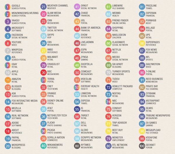
The colours of the Top 100 web brands
In the world of brand design, choice of colour provides the potential for a wealth of carefully crafted and powerfully communicated messages about your brand.What is the most popular and dominant colour online?
Creative community blog COLOURlovers researched the brand colours of the world's top 100 sites and discovered that the web landscape is dominated by a large number of blue brands, however red does occupy a large amount of space. What’s driving this? You would expect that companies organise extensive branding research and market tests to select the colour/s that project the correct message to entice the consumer to the brand. Unfortunately many of the brands that have grown to be global web powerhouses started as small web startups, while large corporate giants with branding departments spend quite a lot on market research, branding, etc.
Lots of the sites listed above got started with brands created by the founders themselves with little to no research into the impact their color choice would have.
Mark Zuckerberg, the founder of Facebook was once asked why he chose blue for his site design… “I’m colour blind, it’s the only colour I can see.” …and now 500 million people around the world stare at his mostly blue website for hours each week. (COLOURlovers)
While the initial rationale for the brand colours may be trivial, the impact that these dominant brands now have in the web landscape will no doubt influence smaller companies wishing to share the positive colour associations they created. Therefore blue and red will most likely continue to dominate, but we can hope that new brands entering the market take a different perspective and decide to push the colour boundaries of their brand.
Source: Truly Deeply

Thursday, January 20, 2011
Cute pantone chip cookies
I love the Pantone craze, but this is a little extreme... I do love the thought and attention that's gone into them though. Inspired by a Pantone tin, freelance designer and illustrator, Kim Neill. created these cookies using her collection of Pantone chips and worked with Royal icing to create the exact colours, even using luster dust to create metallic “chip” cookies. Once the icing set, she used an edible marker to add the Pantone numbers and Bob's your uncle! These would make lovely client gifts.


Wednesday, June 9, 2010
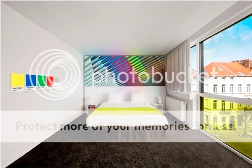
A 'colourific' Pantone Hotel has opened in Brussells
The Pantone colour system (a colour scheme that's universally used by art directors and designers) has colourfully clouded my professional life ever since I can remember, and I've got to admit I'm a sucker for the merchandise spin-offs, be they business card holders or coffee mugs, and now that a new Pantone Hotel has opened, I'm more than a bit intrigued.
The seven-floor hotel, just off Avenue Louise in the Belgian capital of Brussells, has 59 rooms and suites which use one of seven Pantone colour palettes, ranging from tranquil and aquatic to daring and fiery. The hotel says it expects guests to “[choose] a room that complements their mood through colour”. The bathrooms at the hotels come with Pantone Universe toiletries.
Apparently the bar offers Pink Champagne Pantone 12-1107, Lemon Drop Pantone 12-0736 and Daiquiri Green Pantone 12-0435 cocktails, and guests can additionally meet Pantone consultants for informal colour consultations.


Monday, December 14, 2009
Colour of the Year for 2010: PANTONE 15-5519 Turquoise

Pantone today announced PANTONE 15-5519 Turquoise, as the colour of the year for 2010.
"In many cultures, Turquoise occupies a very special position in the world of colour," explained Leatrice Eiseman, executive director of the Pantone Color Institute.
"It is believed to be a protective talisman, a colour of deep compassion and healing, and a colour of faith and truth, inspired by water and sky.
"It is universally flattering, has appeal for men and women, and translates easily to fashion and interiors."
Hhhmmmm... I am more of a Pantone Red 485 kind of girl.
Monday, October 12, 2009
Robert Bradford - Recycled Toy Sculptures


I love these colourful dog sculptures, by Robert Bradford, made from discarded plastic items. The objects are mainly toys but there are also other colourful plastic bits and pieces, such as combs and buttons, brushes and parts of clothes pegs.
Recycling is not his primary concern, but each sculpture certainly keeps quite a few pieces from becoming landfill. Some of the sculptures contain pieces from up to 3,000 toys and sell for around £12,000.
From Cool Hunter
Tuesday, July 1, 2008

Saturday, November 3, 2007
Review: Pop Art Portraits at the National Portrait Gallery

I caught this show first thing on Saturday morning. It's a wonderful time to visit the National Portrait Gallery, as this early in the morning the exhibition space is still empty and you can have the place to yourself, enjoying an unblocked view of the works.
The show examines the role of portraiture within Pop Art bringing together key works by all the major Pop artists - Andy Warhol, Robert Rauschenberg, Jasper Johns and Roy Lichtenstein (USA) and Peter Blake, Richard Hamilton, David Hockney and Patrick Caulfield (UK)
Using images of the famous and the notorious taken from the media, the Pop Art portraits created a new breed of fantasy portraiture using the influences of popular art and culture.
Comic books, magazines and other modern mediums were the inspiration for the Pop Art Artists to create altered and transformed images of instantly recognisable faces. An obsession with celebrity and the changing influence of fame, the images are often warped versions of a very familar face or versions of the artist themselves put through the media celebrity filtered lens.
A truly inspiring exhibition - full of colour, wit and lateral thinking.
Pop Art Portraits at the National Portrait Gallery
11 October 2007 -20 January 2008
£7.00-£9.00
Thursday, June 14, 2007
Useful Colour Picker Sites

Colour lovers
Show hundreds of different colour combinations - a great online tool. You can also vote for your favourites and create your own swatches. You will find, in addition, a useful section on colour trends
Colorjack
A colour theory visualiser
Colorblender
Similar to Colour lovers, you'll find many inspirational colour palletes here.
Colorschemer
One more.
Subscribe to:
Posts (Atom)