In the world of brand design, choice of colour provides the potential for a wealth of carefully crafted and powerfully communicated messages about your brand.What is the most popular and dominant colour online?
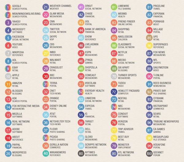
Creative community blog COLOURlovers researched the brand colours of the world's top 100 sites and discovered that the web landscape is dominated by a large number of blue brands, however red does occupy a large amount of space. What’s driving this? You would expect that companies organise extensive branding research and market tests to select the colour/s that project the correct message to entice the consumer to the brand. Unfortunately many of the brands that have grown to be global web powerhouses started as small web startups, while large corporate giants with branding departments spend quite a lot on market research, branding, etc.
Lots of the sites listed above got started with brands created by the founders themselves with little to no research into the impact their color choice would have.
Mark Zuckerberg, the founder of Facebook was once asked why he chose blue for his site design… “I’m colour blind, it’s the only colour I can see.” …and now 500 million people around the world stare at his mostly blue website for hours each week. (COLOURlovers)
While the initial rationale for the brand colours may be trivial, the impact that these dominant brands now have in the web landscape will no doubt influence smaller companies wishing to share the positive colour associations they created. Therefore blue and red will most likely continue to dominate, but we can hope that new brands entering the market take a different perspective and decide to push the colour boundaries of their brand.
Source: Truly Deeply
Monday, February 7, 2011
The colours of the Top 100 web brands



Friday, October 23, 2009
M&S website voted most user-friendly

According to a new Online High Street Report from web usability consultancy Webcredible, M&S has been voted the most user-friendly website of all UK high street brands.
It is a surprise result for M&S as its site only came ninth on the list last year. Meanwhile, WHSmith came joint second, whilst John Lewis maintained its place of third on the rankings.
The criteria used to evaluate the websites includes browsing, navigation, the checkout process , searching and product display pages.
Despite widespread improvements, there are some basic areas where retailers need to do better on, the report found.
Areas that could be improved include using the same form for logging on and registering, allowing customers to alter the number of products displayed on a page and changing the colour of visited links.
See the article in full on BBC News
Friday, July 25, 2008
Web usability
Jakob Nielsen is considered to be the guru of web usability. His expertise is based on human factors engineering, but he has received criticism from many graphic designers for not succeeding to balance the importance of other user experience considerations such as eye appeal.
In any case I find his knowledge very useful and his findings balance out my design eye.
He has written many interesting articles - one of the most useful is Top Ten Mistakes in Web Design. Notice how ugly the design of the page is...