What if logos told the truth? You can't really argue with this idea by Viktor Hertz of a series of honest logos.


Wednesday, April 20, 2011
Honest logos


Evian Baby Inside

Evian has followed up its "roller babies" ad with a new spot that flips adults into dancing babies.
BETC Euro RSCG's "Baby Inside" ad uses a series of images of people wearing t-shirts that have an image of a baby's body on the front, from the neck down.
The images are shown in quick succession, resembling a flipbook, to animate images and make them appear as though the baby images are dancing.
The “Live Young” strapline, strengthens the message of the Rollerbabies film by symbolising the effect of Evian on the bodies of adults of all ages.
Source: Brand Republic
Tuesday, April 19, 2011
Facebook launches Facebook Studio for marketers

Facebook has launched a stand-alone community site where creatives can share ideas, comment on campaigns and learn what it takes to create a successful page for a brand.
Facebook Studio is a sortable gallery of marketing campaigns and it looks like it will be very useful to digital marketers and creatives.
You can search for the most liked campaigns, the most shared campaigns, by language, region and other criteria, and it’s been created because Facebook has been asked for examples and tools for social media campaigns.
You can also search by brands and by sector, and in the Learning Lab tab are detailed explanations of all the Facebook marketing tools available, so it’s easy to keep up to date (or even get up to speed if you’re a complete beginner).
And even if you’re one of those people who derides any borrowing of ideas, it can also be a good way of checking out if you’re idea truly IS a first for Facebook.
Anyone can look at it. You can also upload your own work for others to admire (agencies and clients are credited).
I know it’s an ill wind that blows no good, but are there winds that blow no bad? Facebook benefits because it gets more brands signing up for campaigns; consumers benefit by getting more entertaining campaigns (hopefully); and agencies benefit from sharing intelligence. Go and explore!
facebook-studio.com
Source: The Wall
Saturday, April 16, 2011
T-Mobile's Royal Wedding Entrance Video Goes Viral
T-Mobile has released a Royal Wedding entrance dance video à la the couple that boogied to "Forever" back in 2009. Prince William, Kate Middleton, Queen Elizabeth, Camilla and Prince Charles lookalikes all bump and grind their way down the aisle and into the Internet's viral void.
The ad (by Saatchi & Saatchi, London) will be released solely online, unlike the previous 'Life's For Sharing' spots.
For the record, I was most impressed with Fake Harry's moves.
Freelance Designer vs. Design Agency

There used to be advantages in employing large agencies for big jobs. Economies of scale, strength in numbers, experience and access to resources were benefits of the big boys over a lone ranger. Nowadays, this isn’t true. All a freelancer needs is a Mac and a broadband connection. Large files can easily be moved around quickly, huge jobs – series of billboards, brochures, books, presentations, videos, websites – can sit on secure servers anywhere in the world.
If the scale of the job is too much for one freelancer they can simply call on someone else to help. Files can be downloaded from the freelancer’s FTP site and uploaded when finished. Every freelancer has a network of contacts each with their specialities.
Essentially there are benefits which ever way you decide to go, and neither one is the wrong choice. The first decider is often cost. Freelance designers tend to be significantly more affordable than design agencies because they don't have the same overheads and staff costs and primarily because you are usually paying a single person to work on your project.
So here's my list of advantages of each. It’s also worth noting there’s a certain amount of overlap. For instance, my first reason for choosing an agency is because they’re well-versed in dealing with large accounts. The same can be true of a freelancer.
Reasons to work with a freelance graphic designer
1. From start to finish, the client is talking to the top creative designer on the job, so the project specifications don’t need relayed before action is taken.
2. There are no separate account managers, senior creatives or junior designers, each with differing interpretations of the design brief.
3. The client is hiring the person responsible for 100% of the design portfolio
4. Client phone calls go directly to the designer working on the project — not a sales person or account manager.
5. With many freelancers working from home, they can often transfer considerable savings made through low overheads.
6. Design revisions can frequently be made almost immediately after the request.
7. Billing enquiries and delivery time frames can be clarified at the same time as specific design discussions.
Reasons to work with a graphic design agency
1. Well versed in dealing with large accounts.
2. The client isn’t reliant on the health of one person for the successful completion of the design project.
3. There is often a group of designers collaborating on ideas, offering a broad range of outcomes.
4. Agencies tend to be made up of a number of staff each with their own specialty meaning the overall skill level involved in your project could be higher.
Should the advantages I’ve listed differ from your own experience, please feel free to add in the comments section.
Tuesday, April 12, 2011
Google’s new trivia game demands that you search

Google’s new trivia game defies conventional rules by requiring players to perform search queries to find the answer to a daily question.
It’s called A Google a Day and beyond being a game that will attract web savvy pub quiz aficionados, it may serve multiple purposes for the search engine giant.
Probably the most obvious reason for creating a game like this is that it reveals new data on how users are searching for ultra specific pieces of information, and in ways that were previously only discovered by deduction of whatever data was available. Having users seek out predetermined results (using the search tool on agoogleaday.com, which doesn’t contain real-time results that might reveal the answer and ruin the game) allows Google to reverse engineer how they’re currently tracking and evaluating data.

It’s called A Google a Day and beyond being a game that will attract web savvy pub quiz aficionados, it may serve multiple purposes for the search engine giant.
Probably the most obvious reason for creating a game like this is that it reveals new data on how users are searching for ultra specific pieces of information, and in ways that were previously only discovered by deduction of whatever data was available. Having users seek out predetermined results (using the search tool on agoogleaday.com, which doesn’t contain real-time results that might reveal the answer and ruin the game) allows Google to reverse engineer how they’re currently tracking and evaluating data.

Daily questions (example pictured above) will apparently be more difficult to solve as it gets closer to the end of the week, according to a post on Google’s official blog by User Experience Researcher Dan Russell. Answers will be revealed the following day as well as what search methods were employed to find that answer.
While A Google A Day is more puzzle-based than an actual mini game, it’s still the company’s first serious step into the space, and it looks likely to be a perfect breeding ground for social success as well as advertising revenue potential.
Source: Venturebeat.com
Monday, April 4, 2011
Karen Cinnamon wins Advertising & Design Freelancer of the Year Award 2011.

Karen won the accolade Xchangeteam Advertising & Design Freelancer of the Year 2011 at the UK’s only awards ceremony to recognise freelancers in the media, marketing and communications industries.
Advertising & Design was the highest entered category this year with 53 nominations in total, with 6 finalists.
Judge Matt Potter said, "Karen’s sheer joy in her work shines through, not just in her award entry but in the quality of the work she does, and in the feedback she gets from clients.
Her ability to cut through the hyperbole and find the heart of the issue is her true strength and in a competitive market for freelancers, she’s a great example of someone who pulls off difficult work for demanding clients... and makes it look easy."
Karen additionally was Highly Commended in the Digital Excellence category.
More details on the results here.

Sunday, April 3, 2011
Groupon's brilliant 'Unsubscribe' page

This has, apparently, been around for quite some time. So you’ll have to excuse me if you’ve seen it before.
Groupon.com have built a great unsubscribe page for their email newsletter. They express sorrow to see you leave and offer a funny video to punish their IT guy responsible for sending out the email. Adding this bit of humour and the simplicity of the unsubscribe leaves you with a positive feeling about their company and service.
Click here to see their interactive Unsubscribe page.
Thursday, March 17, 2011
New Google Chrome logo unveiled
A redesign of the Google Chrome logo has just been unveiled.
I think the removal of the previous logo’s tacky 3D effects is a step in the right direction. Another good move towards simplification.
The old Google Chrome logo is pictured below.
Source: Logobird
Friday, March 11, 2011
Nice work for Richard House by The Partners

The Partners have created a great fundraising website for children's hospice Richard House in London. The site allows visitors to create a unique 'exquisite corpse' print using drawings by 120 of the UK's top illustrators...
There are 64,000 possible combinations of heads, bodies and legs to choose from on the site, and users can scroll through them online until they are happy with a selection. For only £60, they can then buy a print of their creation, with all proceeds raised on the site going to Richard House. Act fast though - only one of each combination will be produced as a print, so get in quick to get the one you want.
www.goinggoinggone-red.org
Source: Creative Review
Thursday, March 10, 2011
Nike tattoo eyebrows.
The thin line between brand advocacy and being a moron...
Source: Digital Prescriptions
Monday, March 7, 2011
Freelancer of the Year Awards
Karen Cinnamon has been shortlisted for the upcoming Freelancer of the Year Awards 2011, in two categories: Digital Excellence and Advertising & Design.
The winners will be announced at an Awards ceremony in central London on 31st March 2011.
Tuesday, March 1, 2011

Thursday, February 24, 2011
iPad 2 to be launched next week on Wednesday 2nd March

The rumours have been floating around the web for the last week or so that Apple will be holding a press event on March 2nd to announce details of the iPad 2. Well today Apple have gone and confirmed those rumours and have sent out invites for the official press event entitled ” Come see what 2011 will be the year of”
It’s fairly obvious to assume from the picture that it will be an iPad that’s going to be the focus of the event. It's not clear as to whether or not the iPad will actually be available on March 2nd or not, but one things for certain we will at last find out whats going to be in the iPad 2. It will be interesting to see if its any smaller in size as rumours have suggested and Apple will almost certainly want to be putting at least one if not two cameras in there if they want to keep up with the competition.
All will be revealed next Wednesday… the event will be held at the Yerba Buena Center for the Arts in San Francisco at 10:00am where Apple have launched products before.
Wednesday, February 23, 2011
An app for instant idea evaluation
Creatives always have the same problem: is an idea any good? With this app we can apparently get an instant evaluation. You record your idea into your iPhone and then hold the phone over your head. After a few seconds of "processing" you either get a bright lit light bulb (a good idea) or an unlit lightbulb (a bad idea).
More of a fun app then a serious one methinks...
Download it here.
Monday, February 21, 2011
Very clever livery idea for FedEx (Always first)

The concept was created by an Ad School graduate.
Monday, February 7, 2011
The colours of the Top 100 web brands

In the world of brand design, choice of colour provides the potential for a wealth of carefully crafted and powerfully communicated messages about your brand.What is the most popular and dominant colour online?
Creative community blog COLOURlovers researched the brand colours of the world's top 100 sites and discovered that the web landscape is dominated by a large number of blue brands, however red does occupy a large amount of space. What’s driving this? You would expect that companies organise extensive branding research and market tests to select the colour/s that project the correct message to entice the consumer to the brand. Unfortunately many of the brands that have grown to be global web powerhouses started as small web startups, while large corporate giants with branding departments spend quite a lot on market research, branding, etc.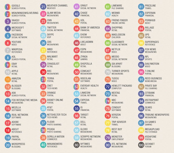
Lots of the sites listed above got started with brands created by the founders themselves with little to no research into the impact their color choice would have.
Mark Zuckerberg, the founder of Facebook was once asked why he chose blue for his site design… “I’m colour blind, it’s the only colour I can see.” …and now 500 million people around the world stare at his mostly blue website for hours each week. (COLOURlovers)
While the initial rationale for the brand colours may be trivial, the impact that these dominant brands now have in the web landscape will no doubt influence smaller companies wishing to share the positive colour associations they created. Therefore blue and red will most likely continue to dominate, but we can hope that new brands entering the market take a different perspective and decide to push the colour boundaries of their brand.
Source: Truly Deeply
Wednesday, February 2, 2011
Good gift for graphic designers

No it's not Photoshopped - you can buy it here.
Source: The Cool Hunter
Tuesday, February 1, 2011
Google Art Project has launched with 17 museums, including MoMA and Tate, bringing "street view" inside the museums

Even the director of the Tate was unaware that if, with patience, you look really close up at Pieter Bruegel's world-famous 16th century painting The Harvesters, which hangs in the Metropolitan Museum, then you will see a family enjoying a jolly Shrove Tuesday game of throwing sticks at the tied-up goose.
"I didn't know about this rather cruel game, no," said Sir Nicholas Serota. "Next time I'm in New York I shall take a closer look."
Serota was speaking at the launch today of a significant new art project by Google. The reason we can now examine Bruegel's painting in such astonishing detail – every tiny scene, every brushstroke, every hairline crack can be seen – is because it has been captured using super-high resolution, or gigapixel photo-capturing technology.
The project, unveiled at Tate Britain in London is an extension of Google Street View in which real views of streets from across the world are captured and displayed on screen.
With the Google Art Project, anyone with access to a computer can take a virtual 360 degree tour of galleries in 17 major museums across the world, without queuing and without other people getting in the way – and look in superb detail at one work from each.
The museums include the National Gallery and Tate Britain in London; the Met, MoMa and Frick in New York; the Uffizi in Florence, the Hermitage in St Petersburg, the Rijksmuseum in Amsterdam and Reina Sofia in Madrid. They have all signed up to the unique project developed over the past 18 months, which allows unprecedented access to 385 rooms and about 1,000 artworks.
Serota called the project "another great step forward. It gives people an unrivalled opportunity to come really close to great works of art."
The galleries are already digitising their collections and offering whizzy websites, but Google's project offers something new, Serota said. "This is a second generation view of the way museums will use the internet. Ten years ago museums were obsessed with getting thousands of objects on the screen, now we're interested in getting depth of understanding of the works."
Nelson Mattos, Google's vice-president for engineering, said the Google Art Project had started off as one of the company's "20% projects" which allows employees to take a fifth of their time away from their regular day job, to work on innovations. "What has been accomplished is fantastic, really amazing. We hope it will provide a very different and new way to interact with and explore art," Serota added.
Other tricks on the website, include the ability to save artworks such as Rembrandt's Night Watch or Van Gogh's The Starry Night, then create your own collection and email it to friends.
Among the 17 paintings captured using technology that is 1,000 times more powerful than an average digital camera, are Manet's In the Conservatory, Bellini's St Francis in the Desert and Holbein's The Ambassadors, from the National Gallery.
Tate Britain's choice – Chris Ofili's No Woman, No Cry – is the only one by a living artist. One reason for its inclusion is the large, hidden ultraviolet message the website reveals (RIP Stephen Lawrence), which can only be seen in the dark.
Google and the museums believe the website will prove popular, as well as provide encouragement and inspiration for people to travel to the galleries and see the paintings up close in person.
The plan is to keep expanding the project, paid for by Google, with new museums, galleries and paintings.
At the launch at Tate Britain the absence of institutions such as the Louvre and the Prado were noted. But project leader Amit Sood, said Google wanted to get the scheme up and running, so included the 17 museums who signed up straight away.
Source: The Guardian
Thursday, January 27, 2011
Brighten up your smile

The Americans may have white teeth, but the Japanese now have blue, green, red and yellow…say hello to LED teeth.
There’s a great video of a guy testing it, the only thing I’m not sure about is the freaky sound.
You can read a small article on them here.
Source: The Partners
Monday, January 24, 2011
The Photoshop Etiquette Manifesto for Web Designers
The Photoshop Etiquette Manifesto for Web Designers is a great site and a neat site design to boot.
It's is a list of helpful and subtle suggestions to organise Photoshop Documents, making the transfer of them less painful.
Saturday, January 22, 2011

Friday, January 21, 2011
Infographic: These passwords are going to get your accounts hacked
Surprise, surprise. The most common password is not 'password.'
Following a survey conducted by ZoneAlarm, the company has compiled the statistics into an interesting infographic below. 
Thursday, January 20, 2011
Cute pantone chip cookies
I love the Pantone craze, but this is a little extreme... I do love the thought and attention that's gone into them though. Inspired by a Pantone tin, freelance designer and illustrator, Kim Neill. created these cookies using her collection of Pantone chips and worked with Royal icing to create the exact colours, even using luster dust to create metallic “chip” cookies. Once the icing set, she used an edible marker to add the Pantone numbers and Bob's your uncle! These would make lovely client gifts.


The Retro Pencil Stylus

This is an easy-to-hold faux writing apparatus (£7.50) that works on all touch-screen devices. Brilliant for glove-wearing / fingerprint-phobic iPaddies and iPhoners. Smudgy fingerprints are no more. Buy it here.
Tuesday, January 18, 2011
The new HTML 5 logo.
I'm afraid that people will get confused between HTML5 and The Jackson 5. 
Thursday, January 13, 2011
Facebook in (quite astonishing) numbers, as of January 2011
- The UK has 13.5m active Facebook users, second only to the US.
- Starbucks is the 'most-liked' brand on Facebook with 6.2m fans.
- The average user becomes a fan of four pages a month.
- 1.5m local businesses have active pages on Facebook.
- 50% of active users log on to Facebook every day.
Source: Facebook
An Exhibition for Hipstamatics

'Hipstamatics' is the first European showcase of snapshots taken using the popular iPhone app that allows mobile phones to mimic antique analog cameras (it was actually awarded ‘App of the year’ by Apple in 2010).
When: 14 January– 31 January 2011. Mon.-Fri., 11 a.m.-5 p.m.
Where: Orange Dot Gallery, 54 Tavistock Pl., WC1H 9RG.
Hipstamatic Facts:
- The original Hipstamatic analog camera was launched In 1982 by brothers Bruce and Winston Dorbowski.
- By the end of 1984 the group had manufactured and sold 157 units.
- The two brothers were tragically killed in a road accident that very same year, meaning that Hipstamatic never became mass produced.
- Now the Hipstamatic iPhone App has sought to recreate the magic of the original Hipstamatic analog cameras. It's got high-res output and gives anyone the ability to hand pick which film, flash and lense is best for a shot. I for one am a fan.
Wednesday, January 12, 2011
CopyPasteCharacter.com

How do I type the copyright symbol? Or the Apple icon? Or that little cloverleaf on the command key? For the quick answer, bookmark this webpage:
www.copypastecharacter.com
Call it the poor man's PopChar. Pull up the web page, copy the character you need, and paste it right into your document. Try it. It really works.
Source: Creative Techs
Friday, January 7, 2011
Karen Cinnamon in the Hospital Club Magazine (January 2011)
Karen Cinnamon interviewed for the latest issue of the Hospital Club magazine (Issue 25, January 2011). Click here to read the article (PDF Format).
Thursday, January 6, 2011
Steve Jobs vs. Dragons' Den
Nice idea for a spoof but there are some classic Dragon's Den quotes and this could have been even funnier! Still worth a watch...
Didn't think anyone loved Apple more than me... I'm wrong
There's a lot of Apple stickers on car bumpers, but this Apple fan covered his entire vehicle in them!

Photos: Taxi Lady Joann
Apple opens doors to Mac App Store

Apple has today (6 January) launched the Mac App Store, which offers more than 1,000 paid and free apps for Mac computers, as it looks to replicate the success of its original iPhone outlet.
The new store, which has rolled out across 90 countries, is similar to the app store for the iPhone and iPad and requiries an iTunes account to make purchases.
It contains more than 1,000 apps at launch, and Apple has also created apps for popular, existing software, such as iPhoto and GarageBand.
Now Amazon is planning to launch its own app store for Android apps. Earlier this week, the online retailer rolled out its ‘Appstore Developer Portal,’ which allows developers to submit android apps ahead of the Amazon Appstore's launch.
Source: Brand Republic
Penguin Classics team up with (RED) for typographic covers
These book covers from Penguin are simply stunning - they work well as a set, yet retain their own identities and I love the way the designs creep out onto the lower banner.
It's a collaboration between Penguin and AIDS awareness fund (RED) and a team of designers to produce new covers for eight Penguin Classics. Each cover replaces the usual black band with red, employing a quote from the text of the book as the visual hit.
Wonderful work as ever from Penguin.


I shot the serif, I did not shoot the Sans Serif iPhone App launched

This game and app should come with a warning, as anyone with a healthy interest in type will be hooked in a few seconds - no clients will get work and the creative industry will be on it's knees within weeks.
Be careful, but give it a go.
Not to be played without supervision of at least one other type aware adult, preferably not the one that pays your wages.
Enjoy!
Try it on their site, or search the app store.
Subscribe to:
Posts (Atom)